UNPUBLISHED
Re-Brand proposal for the Tim Hortons Foundation Camps
Design & Art Direction
Design & Art Direction
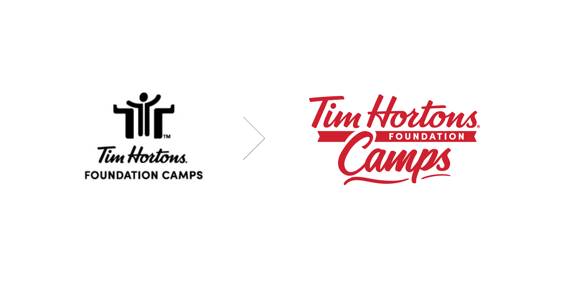
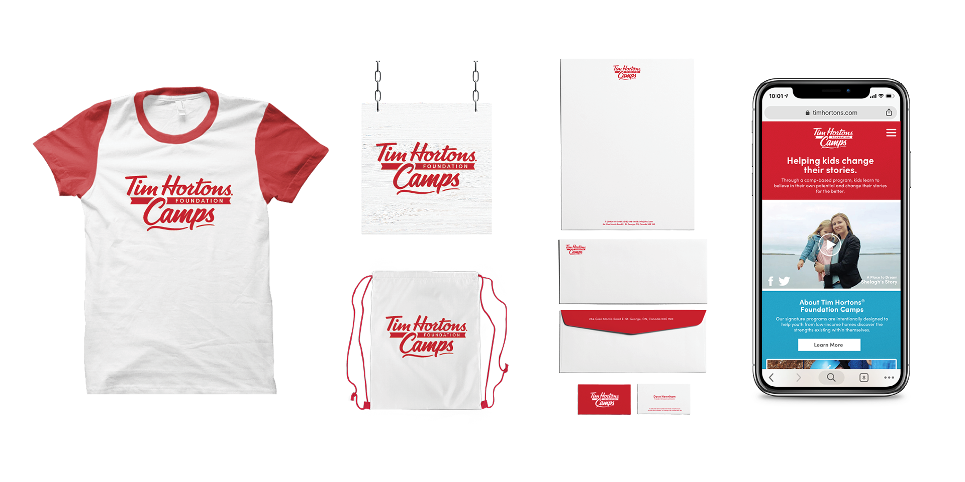
THE TASK
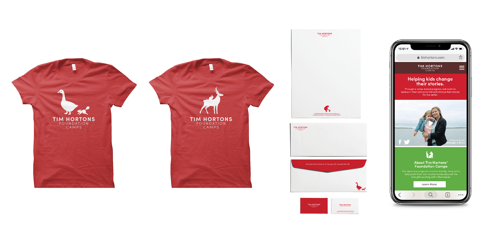
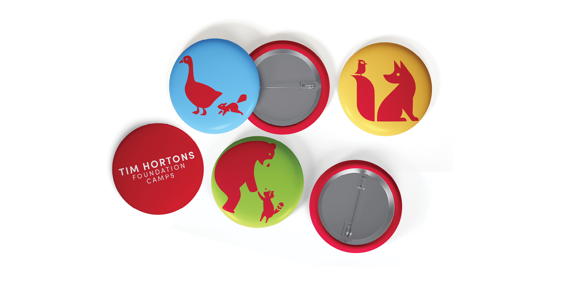
Develop a new identity system for Tim Hortons Foundation Camps.
The system will provide a full range of elements to tell the Foundation’s story.
THE AUDIENCE
The campers
The corporate/philanthropic world
Foundation & Tim Hortons employees
The Canadian public
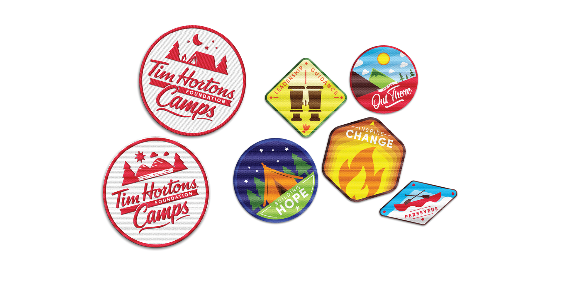
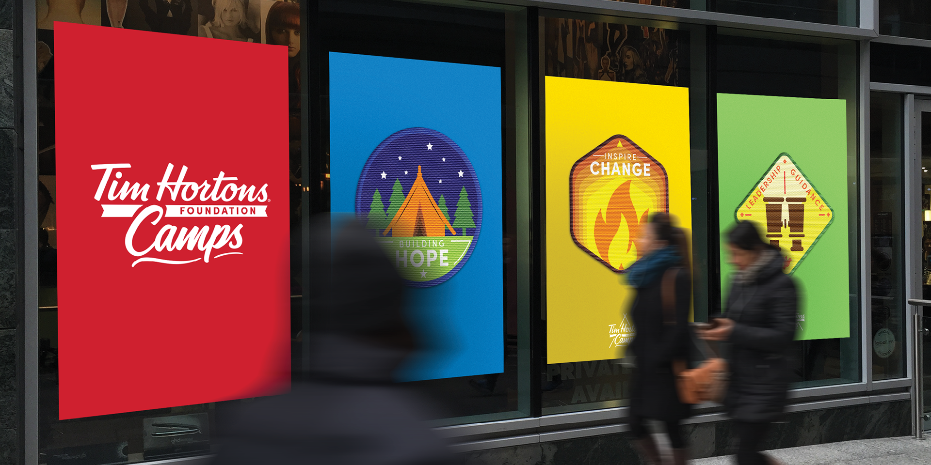
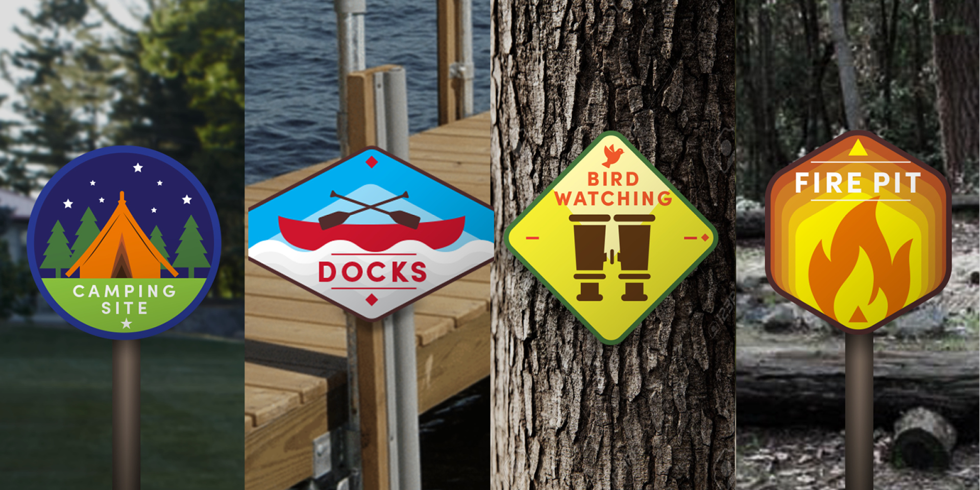
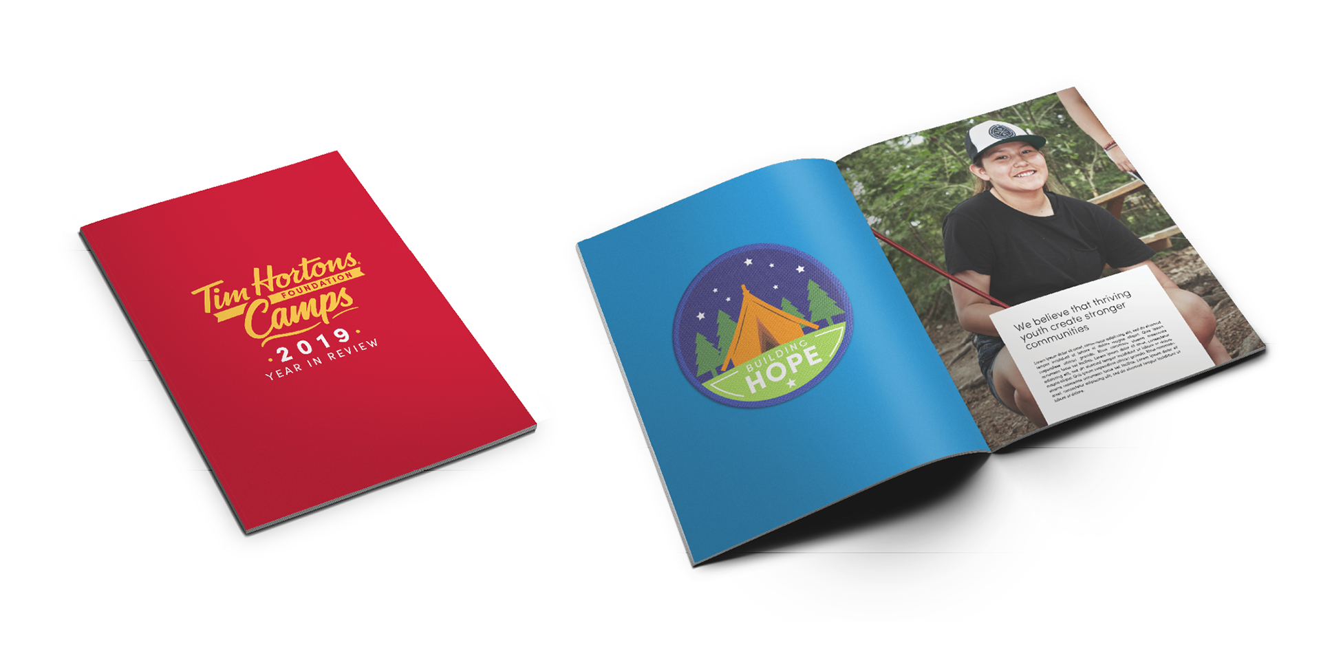
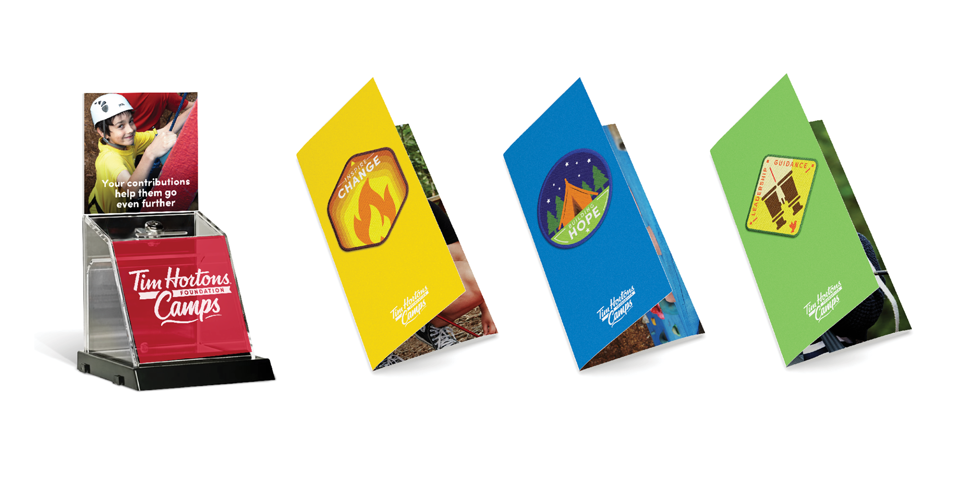
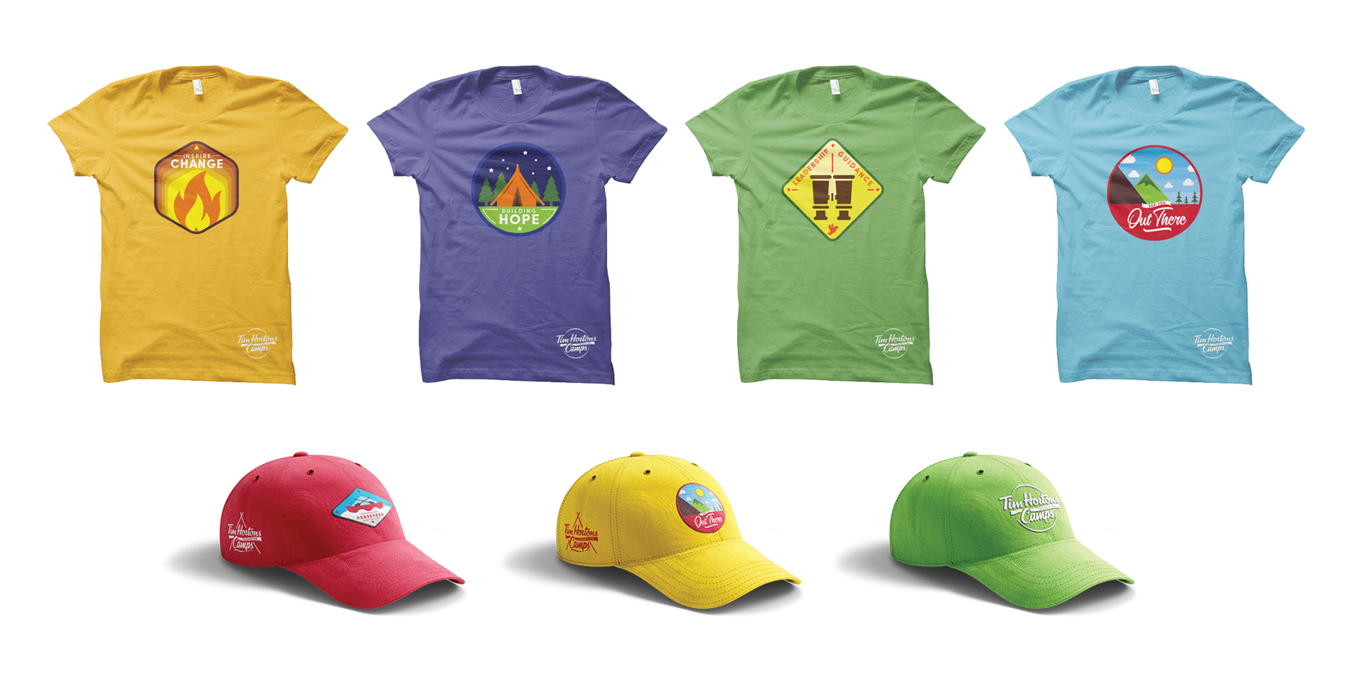
IDEA ONE
Camp comes with a visual language that’s very recognizable, accessible, and fun.
The twist in this idea is presenting the personal growth campers experience through design that is typically used to symbolize tangible skills.
The treatment allows for a really broad range of accomplishments to be visualized and acknowledged, both from the perspective of what a camper gains, as well as what the Foundation enables.
IDEA TWO
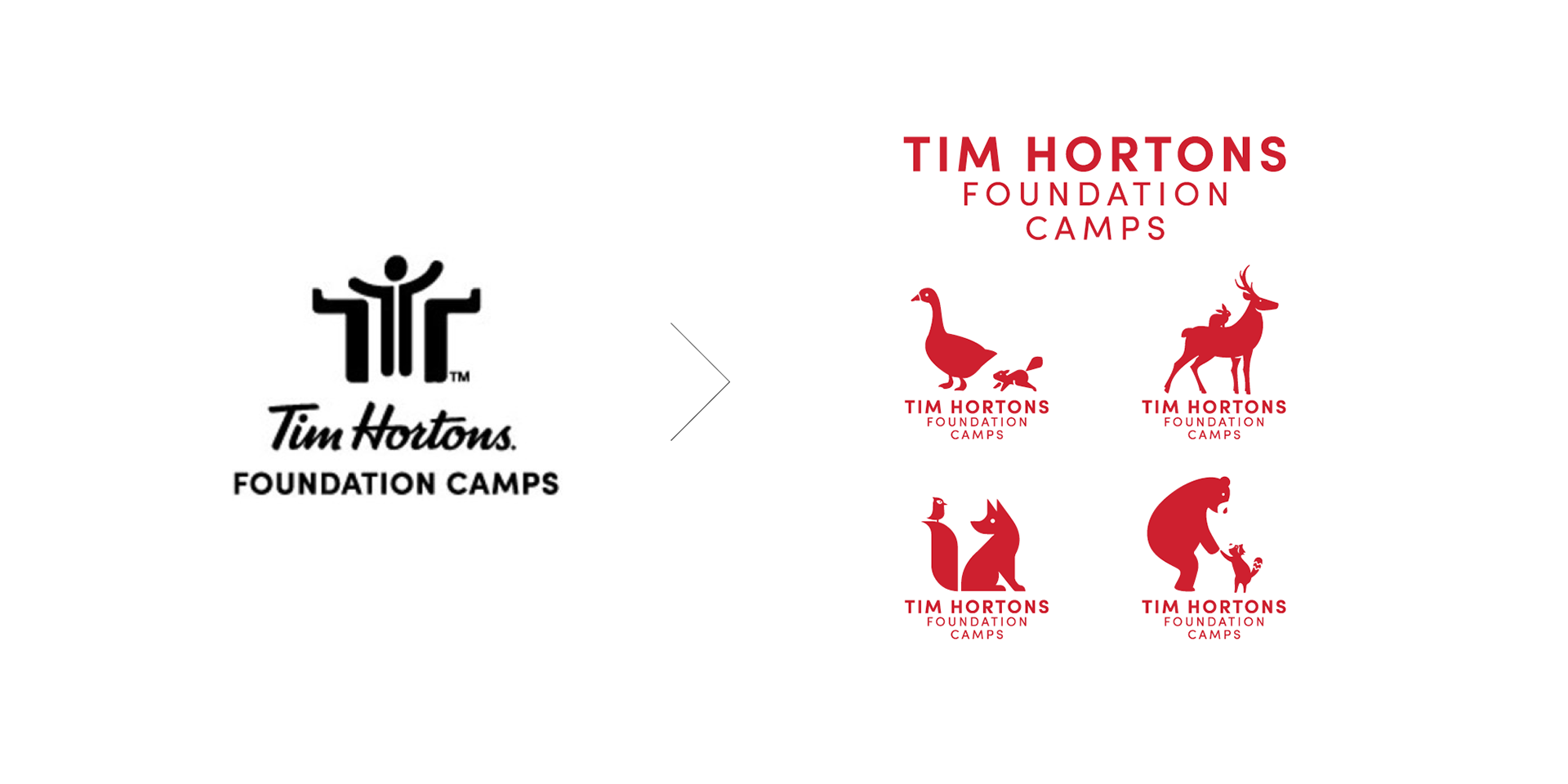
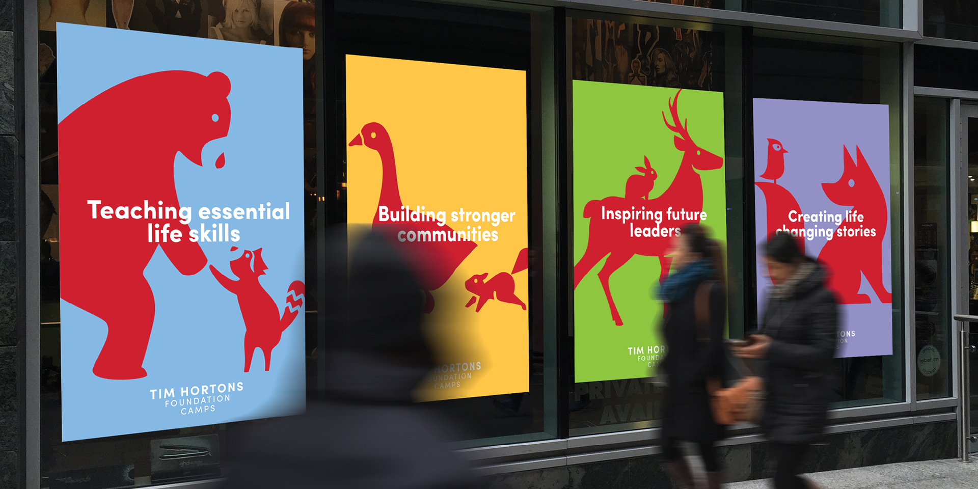
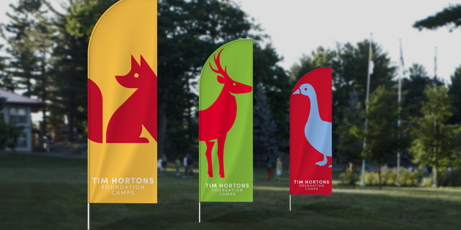
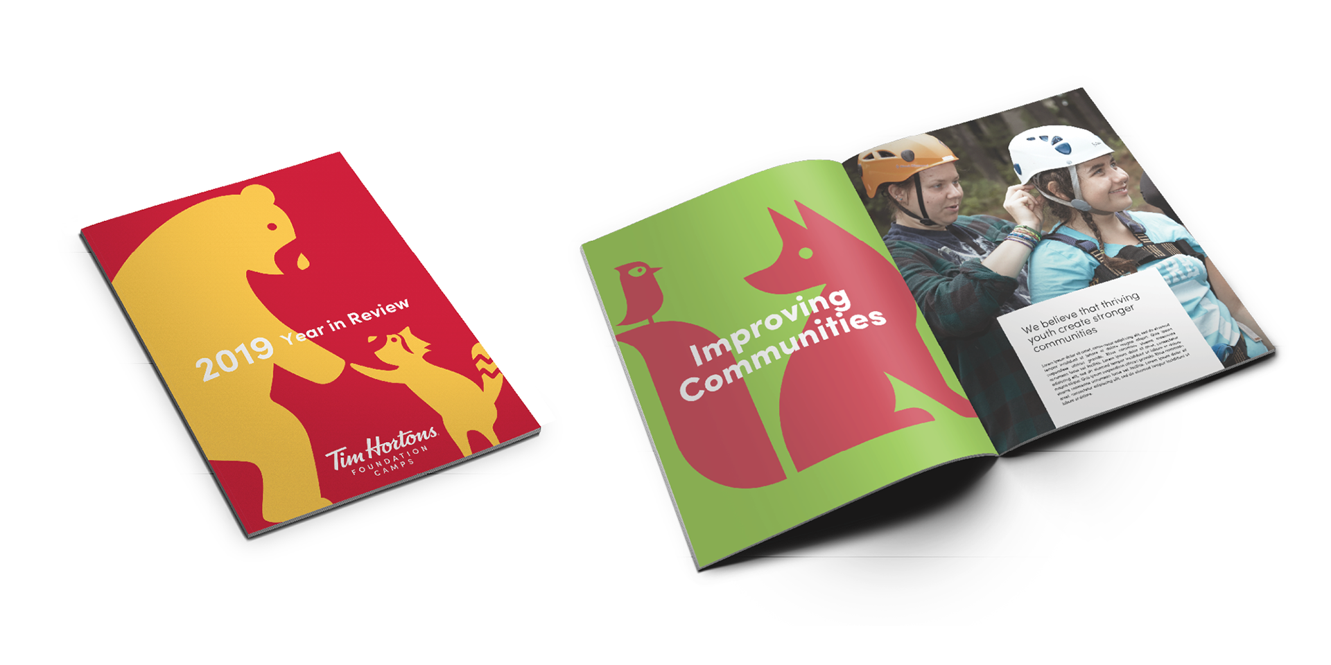
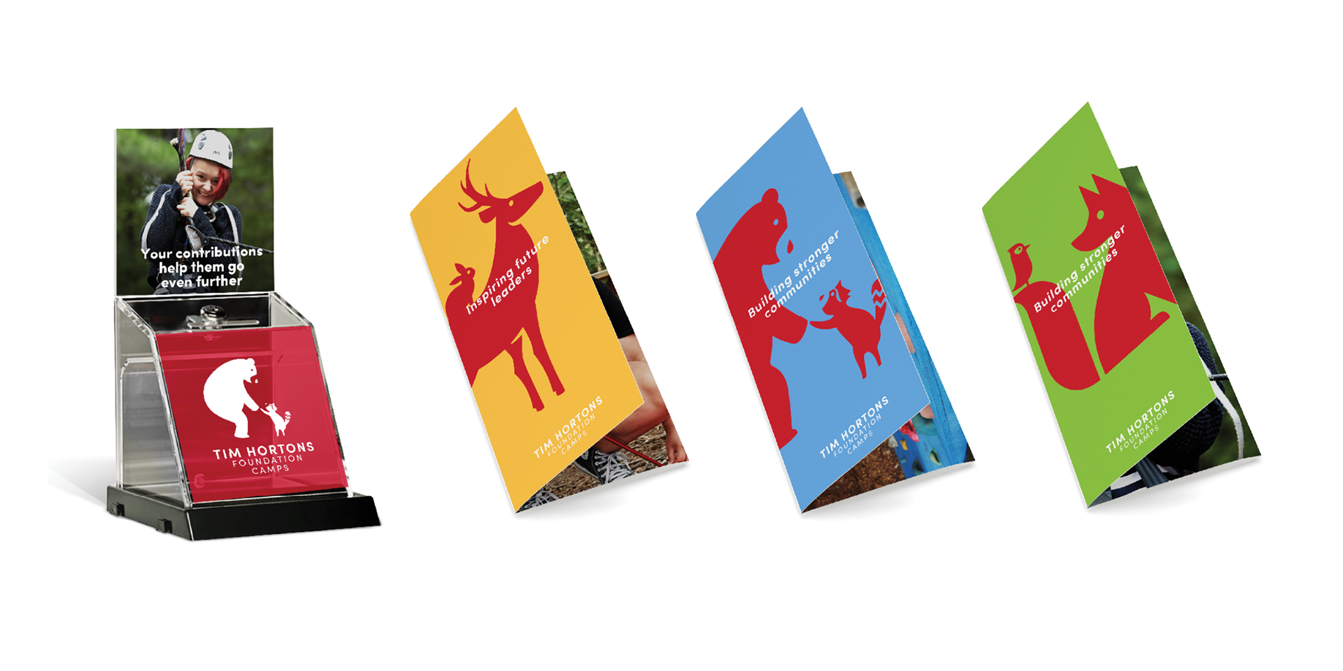
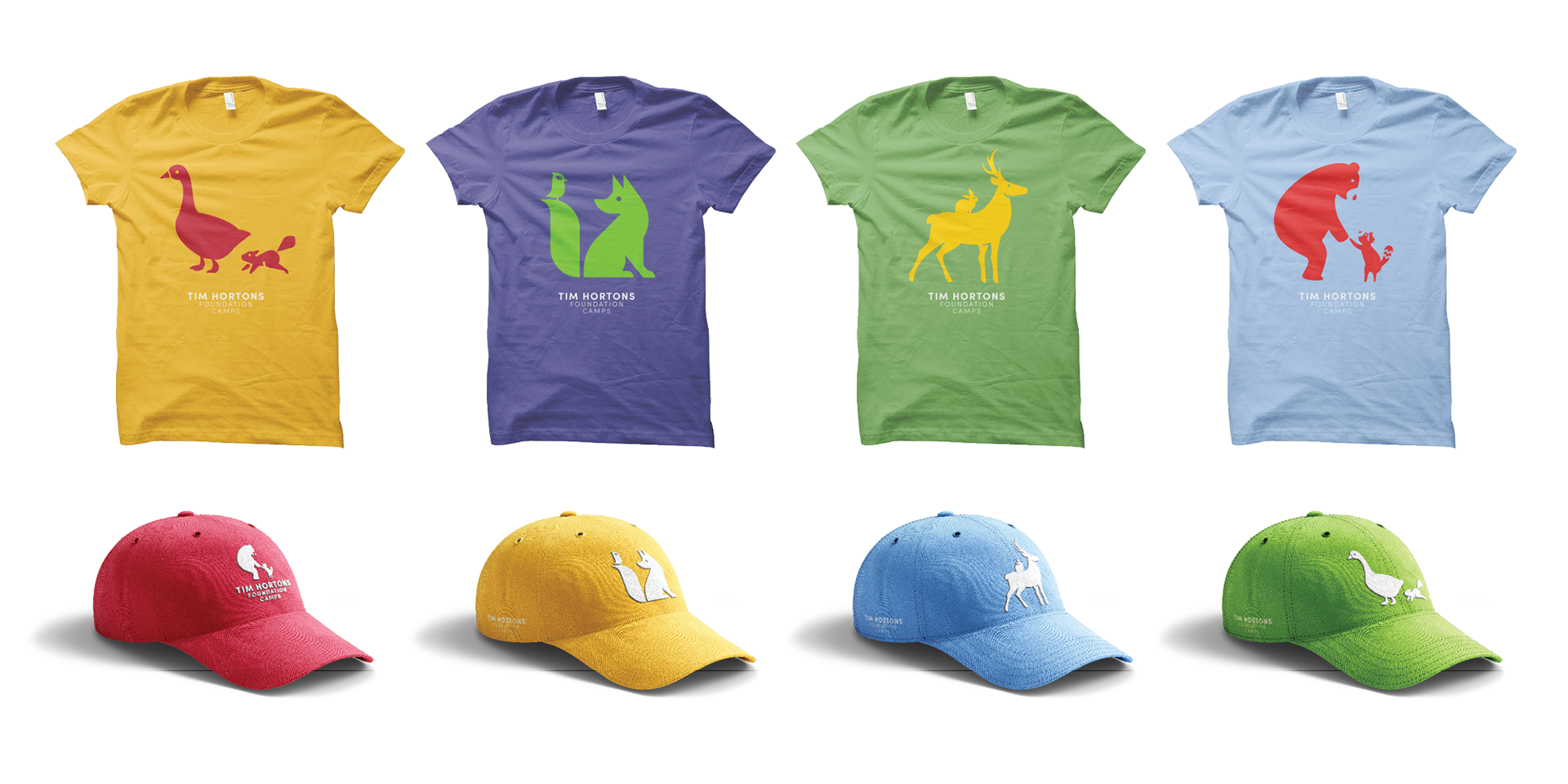
This treatment depicts the nature-based aspects of the camp experience.
You learn the most from people who are different from you. This direction represents the way camp introduces kids to people with different perspectives, and the growth they experience because of that.
We’ve chosen animals from the Canadian landscape to visualize this.
They represent personality traits that can reinforce what the camp teaches. For example:
They represent personality traits that can reinforce what the camp teaches. For example:
- Bears are very protective and attentive to their young.
- Geese work well in teams.
- Deers are agile and surefooted.
- Foxes are quick-thinking and adaptable.